It’s been over 3 years since the ithlete app was originally designed, and with feedback from hundreds of separate users, we knew it was high time for a redesign of the user experience. It’s not so much about adding features (though there are some much requested additions), it’s more about making the process of using ithlete every day fun, satisfying and informative.
With this in mind we set out to find a professional user experience designer with a passion for app usability, found talented and imaginative designer Chris Bush, who agreed to take up the challenge of helping us achieve these aims. Here is a first look at what we’ve created…
Taking your measurement
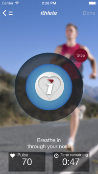
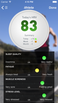
The first part of the redesign was the measurement screen. We have not changed the 55 second duration, or the breathing rate (which was recently endorsed by new research), but we have changed the whole visual experience, from choosing and connecting the 3 different sensor options, through to providing the colour coded HRV number at the end.
More subjective metrics
We have also extended the number of subjective measures that can be recorded to include the most popular ones used in professional sports:
- Fatigue
- Muscle soreness
- Sleep quality
- Stress level
- Mood
- Diet
All have slider controls to allow easy recording of these metrics, either at the same time your ithlete HRV is recorded first thing in the morning, or later on by editing the reading. We have also extended the ability to record text comments with full in-app editing.
In common with many of the latest apps, save operations are now automatic, so you don’t have to worry about whether you saved your reading or any edits. If you are an ithlete Team user, all changes are automatically synced with the cloud server as well!
The dashboard
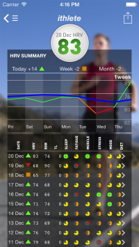
The second major change, and probably the most innovative new screen is the Dashboard. Bringing together the information previously found in the Chart and Edit screens the dashboard allows you to quickly identify not only the HRV and subjective metric changes and trends over the past day, week and month. Looking at these trends will help you identify likely reasons for those changes.
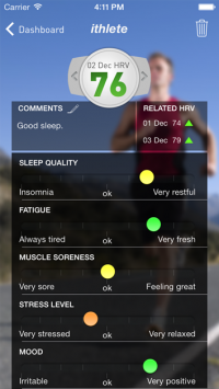 Tapping any row in the Dashboard table allows you to see that entry in full detail. This is also where you can edit the subjective scores, training load number and comments. Each reading is presented in context – the previous and next day’s values & colour codes are shown, and tapping either side of the HRV number allows you to go forward or back one reading at a time.
Last, but certainly not least, you can now post your reading on Twitter, Facebook, or send it in a message also from the dashboard.
Colour coding
Colour coding of HRV readings has been simplified. Although red and amber are the same as before, green is now used to signify any day that is within, or slightly above, the normal range around your baseline.
If you take more than one reading in a day, second and subsequent readings will be shown in grey.
The landscape chart
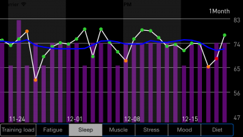 Rotating your device to landscape whilst on the Dashboard screen allows you to see the larger chart. Now you can select any one of the subjective metrics to display against your HRV, allowing you to instantly correlate, for instance, sleep quality or muscle soreness, and identify what it is that is having the most influence on your recovery. Identifying relationships between subjective and HRV will enable you to manage readiness to train in the future too!
Conversely, tapping any row in the Dashboard table allows you to see that entry in full detail, and to edit the subjective scores, training load number, and any comments. Each reading is presented in context – the previous and next day’s values & colour codes are shown, and tapping either side of the HRV number allows you to go forward or back one reading at a time.
Last, but certainly not least, you can now post your reading on Twitter, Facebook, or send it in a message.
Central menu
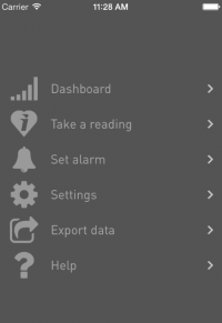 Finally, there is now a central menu that allows you to access the main HRV screens and perform convenience functions such as exporting data. One great new feature you will find here allows you to set a daily alarm that will gently remind you to take your reading (or perhaps enter your subjective measures later in the morning after you have woken up properly!).
Device Compatibility
We have used several of the latest user interface techniques that have been made available in iOS 7, so unfortunately the new app is not backwards compatible to earlier iOS versions. Anyone who simply can’t upgrade to iOS 7 can still use v2.3 indefinitely though. We are (of course) also working on the Android version and hope to bring it out as soon as possible. The reasons for the time difference are mainly due to the tools used for user interface realization and the sheer variety of Android device screen sizes and resolutions, entailing a lot more work to make the app look & work right under Android.
Enjoy ithlete v3!
We really hope you enjoy using the new ithlete as much as we have enjoyed creating it, and please let us know your feedback via comments on this blog and don’t forget to rate or review the app on the App Store.

I just purchased the previous one 2-weeks ago, so do I have to pay for this update or is it an automatic update?
Hi Dan,
Not to worry it’s an automatic update! Available through the App Store now, any problems just let us know.
A couple of points.
1) In portrait mode, my preference would be for the metrics to be horizontal and days vertical (as with the graph). That way any given metric lines up with the day it refers to, so trends can be seen more easily. Also the general sense of a given day (green amber red) for the various metrics is easier to see in relation to the day
2) In landscape mode, I would like the option of selecting any number of metrics, not having to switch between them. ie an on/off display for each metric.
Finally, how long till I can use it on an android?
Many thanks and a very Happy New Year.
In case point one isn’t clear. Each given metric is displayed horizontally below the appropriate day…
D A Y S
M
E
T
R
I
C
S
Hi Chris & Happy New Year,
Thank you for your feedback – it’s always most useful to hear what users think. I’ll be sure to pass these comments back to the team.
Regarding Android I’m afraid we aren’t yet able to fix a time scale to this release. As in the blog post itself it’s just much more complex in terms of development.
Many thanks!
3.0 looks great. Please don’t leave us Androids out in the cold for too long!
It looks great and it shows Ithlete is the right choice!
Great additions in features and cool look.
But as David stated: please, please, please don’t leave us Androids out in the cold too long!
Can you give us a litlle more information on the projected release date??
Makes the waiting a litlle easier….
Hello all,
To those of you asking about Android V3 we wanted to jump in and do our best to answer the question. Right now we don’t have a release date although as soon as we do it will be announced on the blog – as there is news I promise to share it. However please do be assured this is our absolute top priority and we’ll be doing everything we can to get things moving.
Sorry we can’t be more specific at this stage.