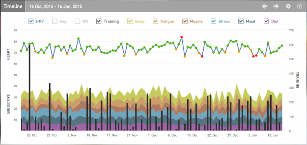
Whilst it is possible to view all your data on a phone with the same layout as on your desktop, it probably makes more sense to choose fewer widgets focusing on the views you are most likely to view quickly on that device such as the Training Guide or the Timeline as shown below.
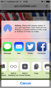
The first thing you want to do is create a home screen icon for ithlete Pro.

By adding ithlete Pro to your home screen you can access it easily. Once launched, the app will fill the screen completely by removing the search box, making more efficient use of the limited screen area. Additionally, the layout settings you use are saved separately for each device, so you won’t need to spend time on these after making your initial selection.
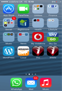
Once added, you will be able to access the ithlete pro app fast & efficiently by simply tapping the icon as shown below.

We’d love to hear what you’ve discovered using the ithlete Pro or any other comments about this weeks Tuesday Tip.
Don’t forget to follow ithlete on Facebook or Twitter to see the rest of the series!


Great job with the pro set up , i like the extra info that the 30 day activity summary gives
Can you elaborate as to how activation is calculated on the y-axis?
Is it simply a reflection on the resting heart rate which is the ‘nervous system’ activity? Or does it also take into account the score you gave your last workout hence comments on energy levels?
Can you also confirm that the x axis recovery is purely a refelction on the HRV score as compared to 30 day average?
regards Chris
Thanks Chris! There is a Tuesday Tip article on how the (patent pending) Training Guide calculations are done at http://www.myithlete.com/tuesday-tip-ithlete-pro-training-guide/
The data is purely physiological at this point, so yes, both axes are derived from the HRV measurement and plotted using Z-scoring on a 30 day rolling baseline.